
Featured Image
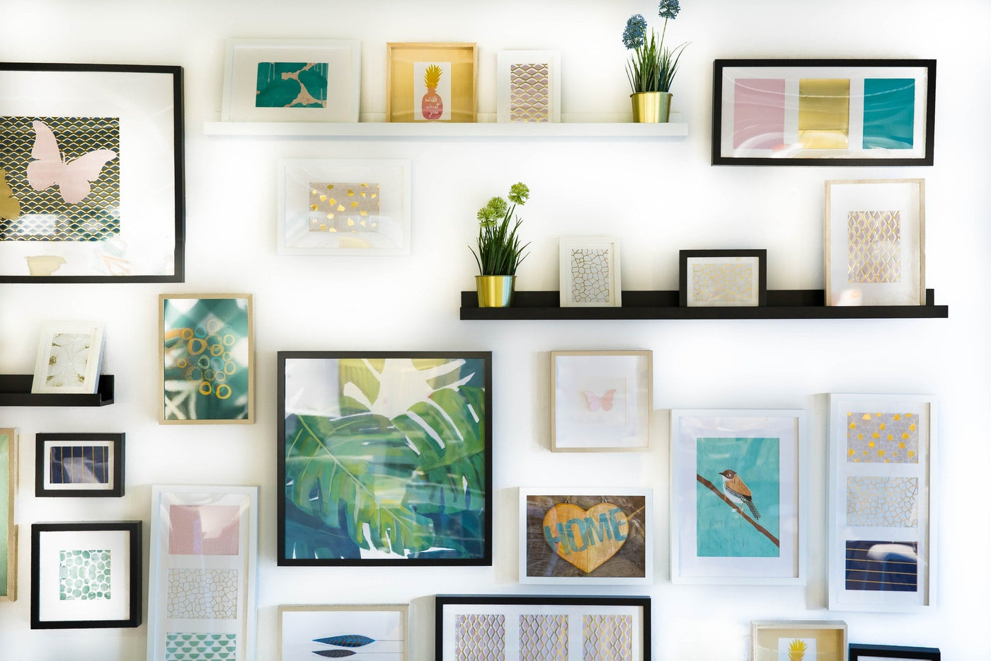
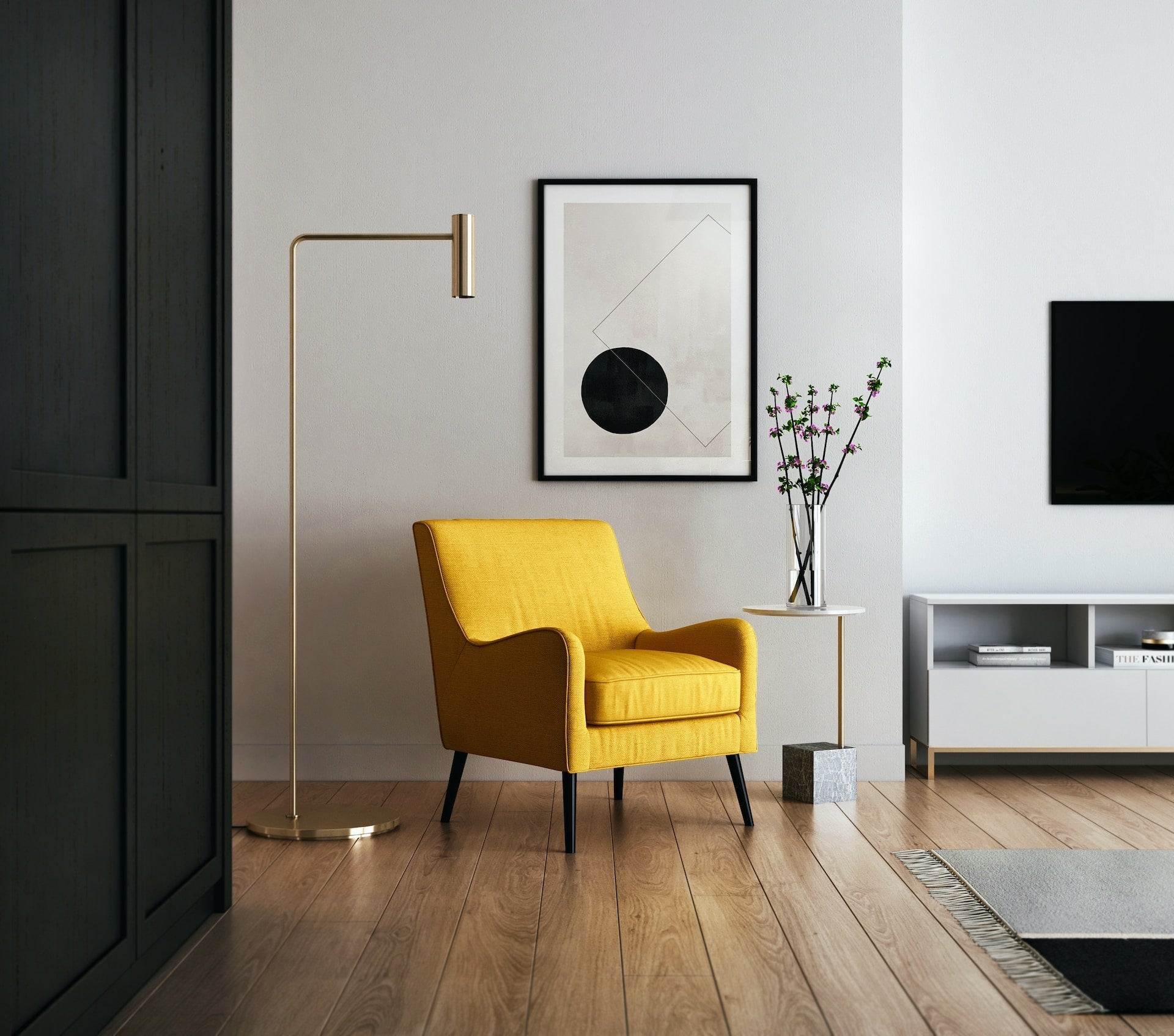
Alt-tag: Five paintings displayed on a wall
A home with no art is like a person with no soul. Void and incomplete. But it's not all about cramming that tiny place with thousands of pieces only to fill the space. Actually, that would be nothing but distasteful. Your home would be much better off, even with just a couple of masterpieces. Provided they are displayed properly, of course. As art is the reflection of our personalities, you are still free to express yourself through artwork. However, may these 7 art displaying mistakes be your guide to what you should avoid for it to shine the brightest.
7 Art Displaying Mistakes You Want to Avoid at All Costs
None of us are the same. It is only natural that our taste in art would differ from person to person. Some of us may be all about the Nordic style, while others prefer their artwork to include more natural elements. Whatever the case, there are certain no-no's associated with putting our pieces out there for everyone to see. Let's dive deeper into what they are!
1. Filling Every Single Wall in the House
The more, the merrier, right? Well, in the case of art, that is NOT true! Many people believe it is through filling every wall that they bring their decorating game to the highest level. In reality, however, all they get is a hectic mess that causes nothing but headaches! The only people that can get away with cramming a variety of pieces all around are art collectors. But even they are sometimes bordering on hoarding.

Caption: Many people believe they should cover all of their walls with as many art pieces as possible.
Alt-tag: A showcase of one of the art displaying mistakes, overflooding walls with a plethora of pieces
2. Making Sure Everything is Perfectly Matching
Not every single piece of artwork has to match. Mixing styles, as well as colors, is acceptable! You are encouraged to be yourself and experiment along the way. Actually, it is the most unusual of combinations that tend to go well together instead of the uniform details that contribute to the place having a dull vibe. It's important not to overdo it, either. The last thing you want is a plethora of brightly colored hues in, let's say, your bedroom.
3. Focusing Too Much on Walls
Art isn't everything hanging on the walls. It's what's on your floors, shelves, everywhere! It's everything that beautifies your living space, including sculptures, antiques, lamps, and more. People tend to forget about these and focus their whole attention on wall art while leaving the rest of their homes utterly void of character.
Don't be afraid of incorporating other forms of art into interior design! There's a chance you've got expensive artwork, perhaps even family heirlooms, lying somewhere in storage. Bring them in, all while making sure to be careful with valuable pieces.

Caption: There isn't a single word that defines ''art''. It's actually everything contributing to one's home feeling ''homey''.
Alt-tag: A bookshelf showcasing various pieces of literature, which is a form of art
4. Not Hanging the Art Properly
Paintings tilting to one side - you've seen it, we've seen it, everyone has seen it! It's possibly the most common of all art displaying mistakes, too. The one we can all blame on one contraption - the infamous nail.
Of course, hanging your artwork on a nail is fine. It is what most people do, anyway. However, instead of using a single nail, your painting may be better off with two of those. There are several other solutions to this problem, including placing your framed artwork onto shelves instead of walls.

Caption: There is nowhere a rule that states framed artwork must be placed on the wall. In fact, you are free to place it wherever you feel like, including on a shelf.
Alt-tag: A picture sitting on a shelf
5. Too High of a Placement
Art is made to be admired, and we can't do that with it sitting above our viewpoint. Or actually, we can, but it's not the most comfortable of positions. Luckily, this problem is easy to fix. To do so, take a page out of the art galleries' book. What they do is place the pieces at eye level - about 60 inches from the floor. This way, the entire artwork is easy to observe in its full size, and you don't have to move your head up nor down to inspect it.
6. Disproportionate Sizes
Disproportions in size between a wall and a piece are also among the art displaying mistakes to avoid! Not even the prettiest of your floral works will look good if it's too big to fit the wall. The same goes for artwork that's too small but placed onto a massive wall. Proportions do matter in the case of art, which means that, if possible, you should aim to adjust the sizes accordingly. If that doesn't seem to be an option, consider putting the piece elsewhere, or go with another one altogether.
7. Lack of Variety
This one goes hand in hand with not everything having to match. It's more of one art piece complementing the other. If everything is of the same shape, size, and color, a home can appear lifeless, thus directly opposing the purpose of art!
While on the hunt for perfect pieces of work, think about the story they tell. Connect several of them to create a unique narrative they will tell together. Think not only framed art but also canvases, tapestries, and everything else you consider worthy of bringing to your home.
Final words
Art has been a part of our lives for as long as the human race can remember. Our ancestors took to painting the insides of caves to express their artistic sides. They were storytellers, using whatever they could get their hands on to create engaging pieces. As humans, we haven't changed much since then in terms of appreciating art. But we have brought it to a whole new level. We've created forms of it that previous generations couldn't even dream of becoming real. These days, we also have the opportunity to display that art in a way that allows it to shine in its full glory. By becoming aware of the most common art displaying mistakes, we can now do exactly that!
Meta description: Art can only shine the brightest if it's properly displayed. In this article, you'll find 7 art displaying mistakes that should be avoided!
Photos used:
https://unsplash.com/photos/XXJ9GMCuA9w
https://unsplash.com/photos/XwdSGEiOahM
https://unsplash.com/photos/KuudDjBHIlA
https://www.pexels.com/photo/various-literature-on-wooden-shelves-in-modern-bookstore-5490916/
Leave a comment (all fields required)
Comments will be approved before showing up.


